The moment you see it
The logos I love most have a secret. Something hidden in the shapes or the space between them, waiting to be found.
I love them because they bring the viewer into the brand’s story. Most logos ask you to look. A logo with a hidden idea asks you to discover something, and when you do, it feels like a small reward. That feeling doesn’t stay with the shape. You attach it to the brand.
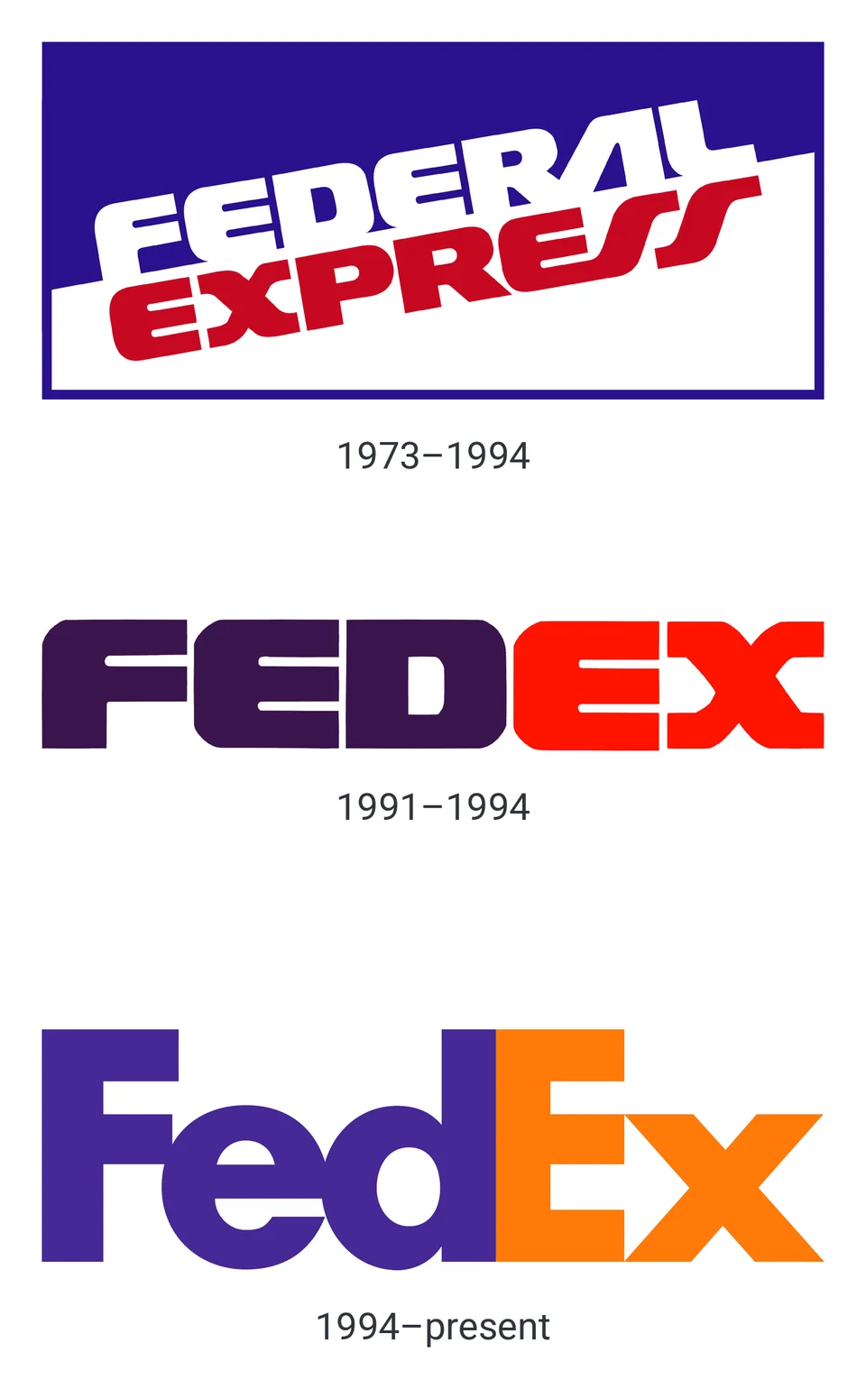
FedEx is the one I always come back to. I believe I first came across it in David Airey’s book Logo Design Love, while I was working at Fairfax. I’ll be honest: I don’t love the colours, and on the face of it I don’t think it’s a particularly beautiful logo. But it’s one of my all-time favourites, purely for the arrow hidden in the negative space between the E and the x. Every time I see it, I feel that small reward again. I’ve shown it to my kids, and I mention it in almost every client briefing as an example of clever design.
Why it works
A hidden idea turns the viewer into a participant. They aren’t just shown the brand. They find something in it, and finding things feels good.
There’s research behind this too. In 2023, a team of psychologists published a study on the FedEx arrow in the journal Cognitive Research: Principles and Implications. Many designers assume the arrow works on us without our noticing, quietly suggesting speed and direction. The study found that it doesn’t: people who hadn’t been told about the arrow didn’t pick it up unconsciously.
But once people knew about the arrow, it changed how they saw the logo from then on. That fits my experience exactly. The value is in the moment of discovery. Once you’ve had it, it stays with you, and so does the brand that gave it to you.
It also makes a logo worth talking about. People point the FedEx arrow out to each other all the time. I do it myself. A hidden idea gives a brand a small story that its audience wants to pass on.
Carpet Clinic: two C’s and a cross
When I designed the logo for Carpet Clinic, my own carpet cleaning business, I wanted it to say more than the name alone.
The word “Clinic” was the clue. A clinic is about care, cleanliness and getting things healthy again, which is exactly what the business does for carpets. So I built the mark from two C’s, one for Carpet and one for Clinic, facing each other, so the white space between them forms a medical cross.
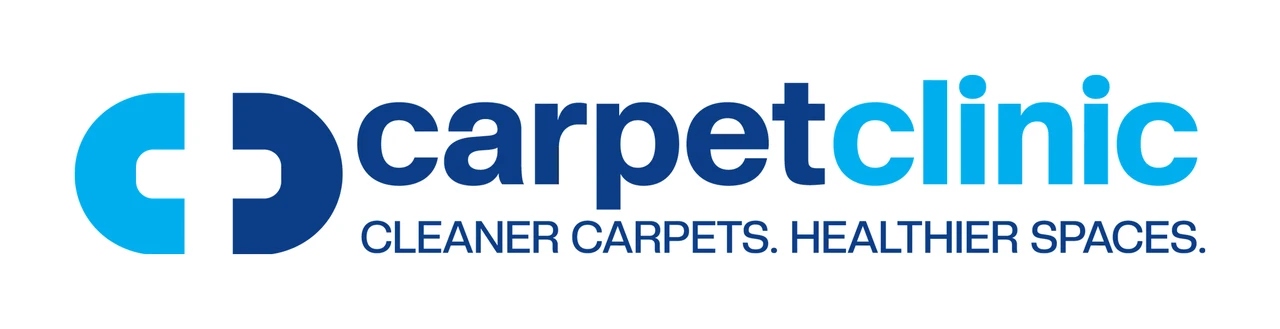
At a glance it’s simply two letters. Look again and the cross appears, tying the shapes straight back to the name and the tagline, Cleaner carpets. Healthier spaces. The colours support the story too, with clean, clinical blues.
I’m a sucker for adjusting type to suit a logo. The Carpet Clinic wordmark is set in a heavy Helvetica-style typeface, but very little of it is straight off the shelf. I edited the C’s so they echo the shapes of the CC mark. I shortened the ascenders and descenders throughout, from the tops of the t and the l to the tail of the p, and dropped the dots on the i’s lower. I also set the letters with extremely tight kerning, so they almost touch. Together those changes make the name stronger and more compact, so it reads as one solid shape rather than a row of separate letters, and sits comfortably beside the mark as a single graphic.
Type straight off the shelf rarely sits perfectly with a mark, so I often go in and redraw parts of the typeface I’m using. Lindon Leader did the same with FedEx.
More from my work
I look for a hidden idea in almost every logo I design. A few examples from my archive:
- Move Launch. The A in the name becomes a rocket, complete with a yellow flame underneath. The idea of launching is built into the word itself.
- Heads-up Advisory. An accounting and business advisory firm. The H and U of the monogram combine to form an upward arrow, a quiet promise of growth that fits their line, We look beyond the numbers.
- The Circle Back Initiative. A program committed to responding to every applicant. The mark is a circular arrow that literally circles back on itself.
- Air Pixels. An aerial drone photography business. The rotors of the drone are drawn as camera apertures, so one shape tells you both what they fly and why.
None of these need explaining for the logo to work. They read clearly as they are. The hidden idea is there for the people who look a little longer.
When a hidden idea goes wrong
A hidden idea is a bonus. It can’t do the whole job on its own. A few rules I keep in mind:
- The logo has to work without it. Most people will never spot the secret, and that’s fine. If the logo only makes sense once it’s explained, it has become a puzzle.
- It has to belong to the brand. The FedEx arrow works because it says forward motion and delivery. A clever shape that has nothing to do with the business is just a trick.
- Don’t force it. If the idea makes the letters awkward or hard to read, it’s costing more than it gives. The best hidden ideas come from spotting something that’s already there. Sometimes the best answer is a simple, well-drawn mark with no secret at all.
- It has to survive small sizes. A hidden detail that disappears on a business card or an app icon isn’t doing its job.
The hidden shapes nobody meant
There’s a flip side to all this. Negative space doesn’t care what you intended. If you don’t look closely, it can hide a shape you never meant to put there, and the internet will find it for you.
The best-known example is the UK’s Office of Government Commerce. In 2008 it unveiled a new logo that reportedly cost £14,000. It looked harmless enough, until people turned it 90 degrees and found a rather rude picture of a man. The story made the national papers, and a spokesman’s defence, that the logo suited an organisation wanting a firm grip on government spending, didn’t help.
Airbnb had a similar moment in 2014. Its new symbol was meant to combine a location pin, a heart and an A. Within days, people online were pointing out the body parts they could see in it. Airbnb kept the logo, and it’s now well known, but the launch week was a lesson in how quickly a shape can be read the wrong way.
That’s why I check every logo the same way the internet will:
- Turn it on its side and upside down. Logos end up rotated on signs, packaging and screens.
- Look at it small and look at it huge. Different shapes jump out at different sizes.
- Show it to fresh eyes. After days on a logo, a designer stops seeing it clearly. Someone seeing it for the first time will spot things you can’t.
The same skill that finds a happy accident like the FedEx arrow is the one that catches an unhappy one before anyone else does.
Finding the idea in your brief
The hidden idea is rarely invented from nothing. It’s usually already there, in the name, the story or the work the business does. My job is to find it.
When I start a logo, I ask a lot of questions. What does the business actually do? What does the name mean, and where did it come from? What do you want customers to feel? Then I look for where those answers meet the letters themselves.
Carpet Clinic is a good example. The idea came straight from the name: two C’s, and a clinic. Move Launch was the same, with the launch hiding in the A. When a name and a shape line up like that, the logo almost designs itself.
The reward
A logo has a hard job. It has to be simple enough to recognise in a second and strong enough to last for years. A hidden idea gives it one more thing: a moment of discovery that people remember and want to share.
That’s why I mention FedEx in almost every briefing. It’s a classic example of rewarding the viewer, and of giving a brand a catchy detail that lives with people long after they’ve seen it.
I always tell clients they don’t need something like that. And you can’t force it. The FedEx arrow was a happy accident. In 1994, Federal Express worked with Landor Associates on a rebrand. Customers had been calling the company FedEx for years, and research suggested the shorter name felt faster, so the name was shortened first. That put a capital E and a lowercase x side by side. The designer, Lindon Leader, had already narrowed more than 200 designs down to six when he noticed a faint arrow forming between them. His skill was in spotting that serendipity and refining the letters, a blend of Univers and Futura, until the arrow worked.
You won’t always find a shape that perfect. But there’s always a way to bring something clever into a brand’s visual story, whether it’s a hidden shape, a meaningful colour or a detail that rewards a second look.
If you’d like a logo with a story worth finding, tell me about your project.
Sources
- David Airey, Logo Design Love: A Guide to Creating Iconic Brand Identities, New Riders, 2009
- “The hidden arrow in the FedEx logo: Do we really unconsciously ‘see’ it?”, Cognitive Research: Principles and Implications, 2023 (opens in a new tab)
- “Logo big or go home: How FedEx’s secret arrow was created accidentally”, Retail Brew, 2022 (opens in a new tab)
- “OGC unveils new logo to red faces”, The Daily Telegraph, 2008 (opens in a new tab)