
A whole page, and a very small car
One of my favourite pieces of design isn’t a logo at all. It’s a magazine ad Volkswagen ran in America in 1959 to sell the Beetle, created by the New York agency Doyle Dane Bernbach with art direction by Helmut Krone.
They paid for a full page and then left almost all of it empty. Near the top sits a small black and white photo of the car. Down at the bottom is a two-word headline, Think small., and a few short columns of copy. Everything else is empty space.
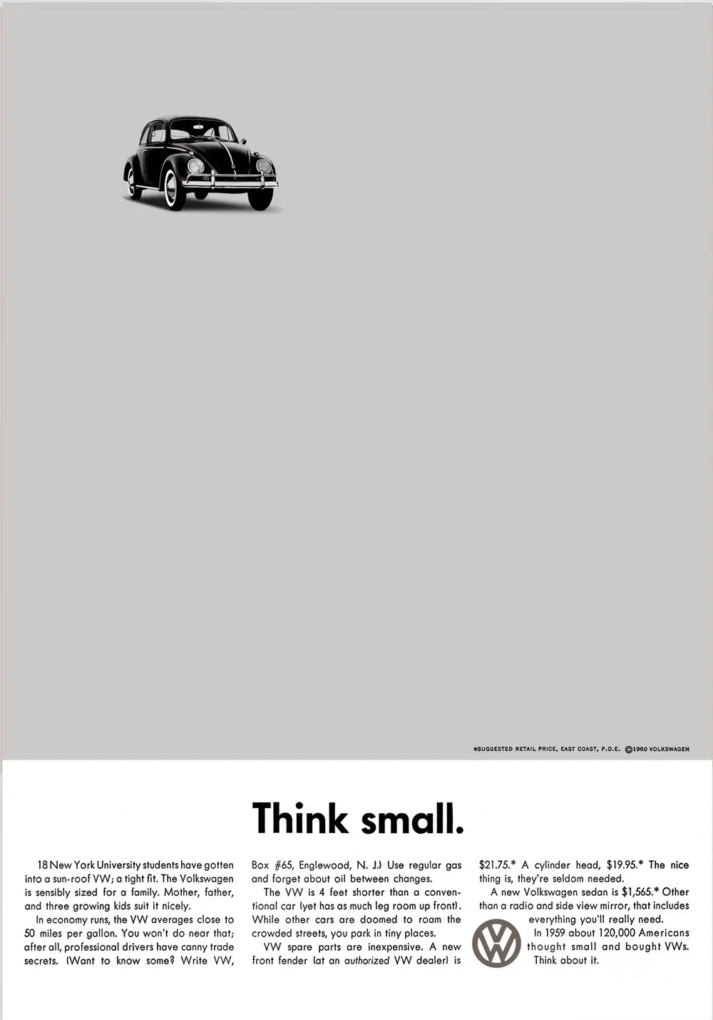
I first came across it as a young designer, working at Fairfax Media by day and studying graphic design at Enmore Design Centre at night. Tony Rice, art director of AFR Magazine and the designer I looked up to most, recommended a book to me, and I believe that’s where I found it: Alan Fletcher’s mammoth compilation The Art of Looking Sideways, published by Phaidon. I couldn’t stop looking at it. That much empty space should feel like a waste. Instead it’s the reason you can’t take your eyes off the car.
Everyone else was shouting
To see why it worked, you have to picture what it was up against. American cars in the late 1950s were getting longer, wider and shinier every year, and the ads matched. Big colour illustrations, glamorous people, and as many claims as they could fit on the page.
The Beetle was the opposite of all of that. It was small and odd-looking, and it came with a dark past. The name Volkswagen means “people’s car”. It began as a Nazi project that Hitler promoted as a car for ordinary Germans, built in a factory the Nazis set up in Wolfsburg. Fifteen years after the war, it was a very hard car to sell to Americans.
Doyle Dane Bernbach, led creatively by Bill Bernbach, didn’t try to hide any of that. Krone and copywriter Julian Koenig made the smallness the whole point. Where every other car ad filled the page, they emptied it.
Why the empty space works
It tells your eye where to go. With nothing else on the page, there’s only one place to look. The car sits in the top corner, angled slightly so it points you down towards the headline. You follow it without thinking.
It creates tension. The car sits up in the top left corner, while the headline and copy are centred at the bottom. The two don’t line up, and that imbalance gives the page a strong visual tension. The car and the type are the positive space. The emptiness between them is the negative space, holding them apart and pulling your eye from one to the other. A neatly centred layout would feel safe and still. This one feels alive.
It makes the car look confident. A small car on a crowded page would look like it was trying to keep up. On an empty page it looks like it doesn’t need to. The space does the boasting so the copy doesn’t have to.
It matches what the car is. The Beetle was simple and honest, and the ad was too. Black and white when everyone else was in colour. Futura, one of my all-time favourite typefaces, when serif type was the norm. Even a full stop after the headline, which sounds like nothing until you notice how firmly it ends the thought.
It earns the reading. Because the page is so calm, you actually read the copy at the bottom. It’s short, a bit self-deprecating and genuinely funny. By the end you’ve been given a handful of good reasons to buy a small car, and it never feels like a sales pitch.
The layout itself was traditional: a picture, a headline and three columns of text. What changed was the proportion. Give the main idea room, and people pay attention to it.
Out of curiosity I once laid a Fibonacci spiral over the page, and the car sits almost exactly where the spiral tightens. Krone himself described the layout as a standard two-thirds picture, one-third copy format, so it may be instinct rather than maths. Either way, it shows how naturally balanced the page is.
More space that does the talking
Think Small wasn’t a one-off. Krone designed it at the same time as another Volkswagen ad, Lemon, which ran in 1960. Same calm layout, same small photo, and a one-word headline calling the car a dud. The copy then explains it was rejected for a tiny blemish most people would never notice. Once again, the space and the honesty do the selling.
The same idea shows up in the logos I love most, where the empty space carries the meaning:
- FedEx. The arrow hidden between the E and the x. I’ll be honest: I don’t love the colours, and on the face of it I don’t think it’s a particularly beautiful logo. But it’s still one of my all-time favourites, purely for that arrow in the negative space. Most people don’t notice it for years, and once you do, you can’t stop seeing it. I’ve shown it to my kids and I mention it in almost every client briefing as an example of clever design.
- WWF. The panda is only partly drawn. Your eye fills in the missing edges, so the white of the page becomes part of the animal.
- Toblerone. A bear standing in the mountain, made from the space inside the shape. Fitting, since the chocolate comes from Bern, the city of bears.
In each case the designer has trusted the viewer to do a little bit of the work. That small moment of discovery is exactly what makes them stick.
The part people overlook
For me, this is the most remarkable thing about the campaign, and the part people tend to forget. A car that started as one of Hitler’s projects came to be seen as friendly, honest and a little bit funny.
The ads never mentioned the car’s history. They didn’t need to. They gave people a new way to see the Beetle, and that new picture was so clear and so likeable that it replaced the old one.
It’s a reminder of how much design and advertising can shape what people think. That power is worth using carefully.
There’s another twist I love. The ads were set in Futura, designed by the German typographer Paul Renner in 1927. Renner was an outspoken critic of the Nazis, and in 1933 they arrested him and dismissed him from his teaching post. A car born as a Nazi project was sold to America in the typeface of a man the Nazis had persecuted.
What it means for your business
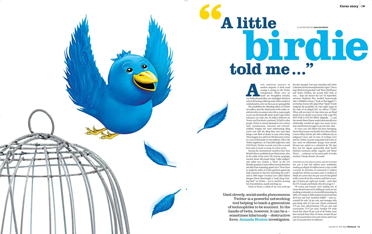
I spent fifteen years designing pages at Fairfax Media, and the pressure was always to fit more in. When I illustrated “A little birdie told me…”, a 2011 Good Weekend story about the perils of Twitter, I pushed back and left most of the opening page empty. The bird bursts out of an open cage into all that white space, and the space is what makes it feel like it’s escaping. It’s still one of my favourite pieces of my own work.
Small businesses feel that same pressure. When you’re paying for a flyer, a website or a sign, it’s tempting to use every centimetre. Every service, every phone number, every special offer. The result is a page where nothing stands out.
Think Small is a good test for any piece of design:
- What’s the one thing you want people to see first? Give it the most room.
- What can you take away? If the message still works without it, it probably didn’t need to be there.
- Does the space suit the brand? A calm page says you’re confident in what you offer.
I use the same thinking in my logo work. The Carpet Clinic mark uses two C’s that form a medical cross, so the shapes and the space between them tell the story of the name. The Defined Media D is built from just a square and an arc. Simple shapes and well-used space are what let a logo work at the size of an app icon or across the side of a van.
Room to be noticed
More than sixty years on, Think Small still makes the point better than any design rule. In 1999, Advertising Age named the Volkswagen campaign the best ad campaign of the 20th century. It got there by saying less and leaving room.
If you’d like a logo, website or piece of print that gives your business that kind of room, tell me about your project.
Sources
- Dominik Imseng, Think Small: The Story of the World’s Greatest Ad, Full Stop Press, 2011
- Alfredo Marcantonio and David Abbott, Remember Those Great Volkswagen Ads?, Booth-Clibborn Editions, 1993
- Bob Garfield, “The Top 100 Advertising Campaigns of the Century”, Advertising Age, The Advertising Century special issue, 29 March 1999
Further reading: Alan Fletcher, The Art of Looking Sideways, Phaidon, 2001. A huge collection of visual ideas, and one of the best books on visual thinking there is.